March 04, 2013
Final Stages
I finally finished Project #3! This concludes the first part of my larger final project, which will consist of a final neighborhood with 11-12 houses and a camera animation. After spending much more time than I anticipated on prepping and repairing these first 6 houses, I think I will be able to use the existing geometry and texture maps to complete the next set of houses. I learned an incredible amount through trial and error about textures and creating and applying them, and once I have the geometry of the next houses completed and prepped for displacement maps, I should be able to use my current textures (with a variation of color maps and scales).
There are a few problem areas that remain unresolved, such as the window glass shader, some of the textures, and the color palette, but for the sake of time I needed to complete this part so I could move on to model the next part. Once I have all of my houses in place and UV'ed, I will be able to go back and bevel edges that may have been forgotten, or add or change detail from some of the existing textures.
Finally, I struggled with the ground plane but needed to place something under the houses to make their current, yet temporary, environment more believable. I am happy with the texture I created, but I believe the problem has to do with displacement versus bump maps, which will also be resolved, if not changed completely, later on.
March 03, 2013
Texturing, continued
At this point, I have about one week left until my prospective deadline. I admit that I have fallen behind schedule due to the fact that I had so much to learn "the hard way" or through trial and error with texturing. I initially had problems with the geometry of the houses because I had edge loop repairs that needed fixing. I also learned that in order to use displacement maps correctly (displacement actually changes the shape of the geometry, bump maps do not), I would need to increase my geometry by adding more edge loops. This process took about 2-3 days because I began by using a corrupted edge loop tool that actually duplicated all of my geometry and created coplanar faces. After spending more time than I probably should have trying to correct the geometrical problems that resulted, I realized it may have been the tool and I should go back into an original file and start from there. That took an additional day to complete.
Once I had successfully prepped my houses to be displaced, I went in to start hand-painting my textures. This was really where I realized I had a steep learning curve and too little time! I then set myself back another few days just trying to tackle the textures! The first texture I had my heart set on was the cobblestone texture, shown below. I painted many of the stones myself in Photoshop until I was able copy and paste sections of it to fill the 2048 x 2048 canvas. However, the part that seemed the most tedious was painting each of the stones a different hue from my color palette, and then going back in and painting detail. Once the texture was completed (3-4 days later!), I needed to spend more time experimenting with the size and scale and UVs from the houses I wanted to apply it too. The only way to accomplish this was by trial and error, which can take up a lot of time. I definitely learned a lot, and a lot of lessons! But I'm not sure that I was happy about learning the hard way for this project with only 2 weeks to do it! I tried to make my other textures simpler to create so I could move on to my next 5 or 6 houses.
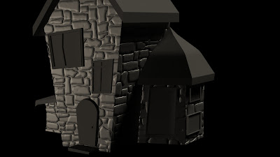 |
My first texture, hand-painted! the displacement of the stones that
you see here was created by painting simple black and white shapes in Ps
(black will recede, white will pop out, therefore, the stones were painted
white) |
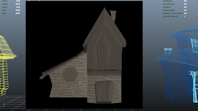 |
The cobblestone texture - as applied with a UV repeat of 1, which
creates larger stones |
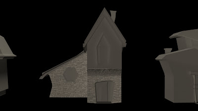 |
| The cobblestone texture with a UV repeat of 2, thus creating smaller stones |
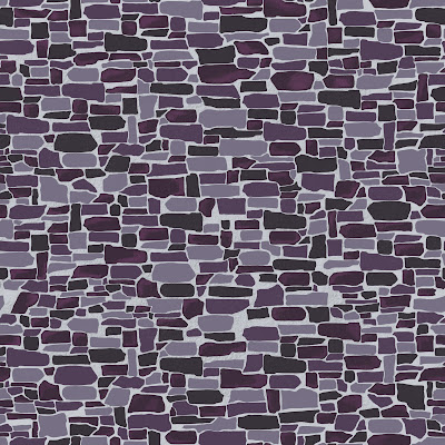 |
Texture #1 - cobblestone texture. Each stone was hand painted and
then copy/pasted to fill the page. For the color map you see here,
each individual stone was colored 1 of 4 hues of purple - this took
many, many days and even more hours! |
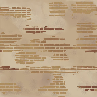 |
Texture #2 - broken brick. This texture was also hand painted, shapes
and colors alike. |
 |
Same for texture #3! Hand-painted cracks and use of brushes and selections
to paint the color maps. I will create different colored maps once I have
onto the next set of houses and the second part of the project. |
February 24, 2013
Texturing
I was looking forward to beginning the texturing portion of this project, but had a more difficult time with it than I anticipated. The only experience I have had so far with texturing and maps (bump, displacement, color, etc.) has been with the Jeep, which required relatively simple textures, such as the tire treads.
From the conception of this neighborhood project I wanted to create my own textures, which was the part that I got hung up on so easily. I ended up losing about a day and half's work due to the fact that I had more figuring out and learning to do about creating bump maps than I had thought. Finally, I ended up with a bump map for my initial texture, the cobblestone. After experimentation and tests that resulted in the texture shown below, I have a better understanding of the general process and will be able to create the remaining variations, hopefully at a quicker pace! I intend to create 3-4 textures for the house bodies, and 2-3 for the rooftops, and distribute them throughout all of the houses in the neighborhood according to my concept drawings. Once the bump maps are finished, I will create the color maps for each respective texture by painting those by hand as well (in Photoshop).
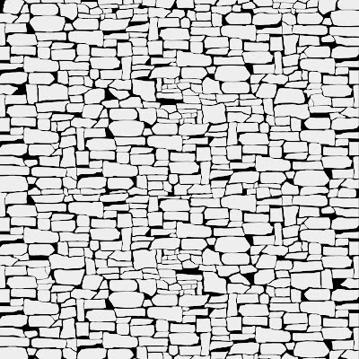 |
| the cobblestone texture, hand-painted in Ps |
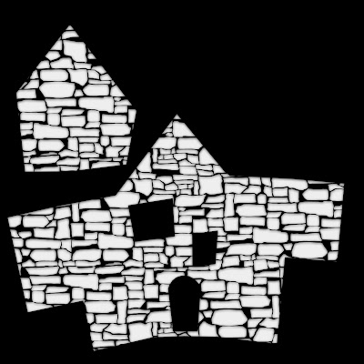 |
the cobblestone texture as applied to the UV snapshot of one of the houses;
an inner shadow is applied to the texture to create a more subtle transition
between the raised cobblestones (white) and the flat wall (black) |
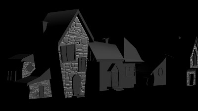 |
a test-render of the bump map, applied to the house that corresponds to the
concept sketch |
February 23, 2013
Modeling
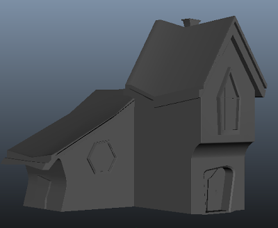
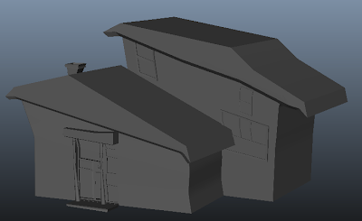
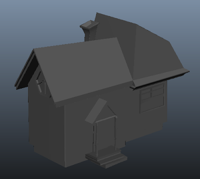
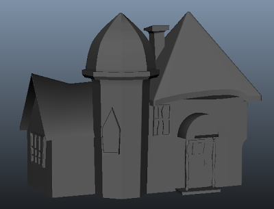
I have just finished the models of the 6 houses for the "Neighborhood Project". While the process of modeling the houses went more smoothly than I had anticipated, I found I had trouble translating my concept sketches into blueprints because the perspective in my drawings was inaccurate. I had to model partially from my concept sketches, and partially from my imagination to make houses that looked compositionally and aesthetically pleasing.
I tried to mimic the way houses in reality are constructed by connecting the houses and deleting their walls, or faces, as a real house would have rooms that open up to one another. Having learned from my vehicle project, I worked in reverse by modeling separate components and merging them if necessary, rather than extruding from a single object and extracting the pieces to be textured differently later.
I still wish that the houses looked more stylized and asymmetrical than they do, drawing from my sources of inspiration, but I think that will come from gaining more experience modeling. Once I have an even better understanding of what I can and cannot do to alter the geometry and still maintain a clean mesh, I will be able to model more stylistically in the future. But for the sake of this project, I wanted to preserve cleanliness and avoid geometrical problems so that my textures would still convey the mood I am going for. I'm looking forward to creating my own textures for the first time! Below are some images from this portion of the project.
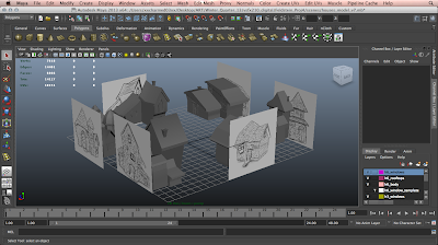 |
| screenshot of Maya scene file - concept sketches used as blueprints |
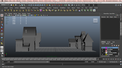 |
| screenshot of the "street" of the neighborhood |
 |
| side A |
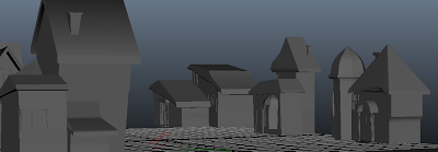 |
| side B |
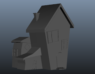 |
| house 1 |
 |
| house 2 |
 |
| house 3 |
 |
| house 4 |
 |
| house 5 |
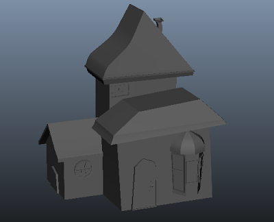 |
| house 6 |
February 17, 2013
The Neighborhood Project - Research and Planning
The "Neighborhood Project" will entail two parts: modeling, texturing and lighting 6 houses, and then modeling, texturing and lighting an additional 6 houses to comprise a neighborhood. I was strongly inspired by the movies Laika's "ParaNorman", Sony Pictures Imageworks "Hotel Transylvania" and Pixar's "Up" for the style of the houses and the overall mood or tone of the neighborhood itself.
Below are the concept sketches of the 6 houses I have created for the first part of this project.


No comments:
Post a Comment